Foundations
Where every statistics course begins
Data and Variables
Everything downstream depends on knowing what kind of variable you have.
Conditions
Variables
- —
- —
Conditions
Variables
- —
- —
Types of Data and Variables
Foundations
Descriptive vs Inferential
Describe the data in front of you. They summarize patterns, averages, and variation without making any claim beyond the sample itself.
Examples
- The mean of a class’s test scores
- A boxplot of last month’s sales
- The standard deviation of a sample
Use sample data to make predictions or draw conclusions about a larger population. They test hypotheses and estimate unknown values.
Examples
- A confidence interval for a population mean
- A hypothesis test comparing two groups
- A regression model used to predict
Statistic vs Parameter
A value calculated from part of the population. Statistics are not fixed — they change depending on which sample you happened to draw. How a statistic varies across all possible samples is its sampling distribution.
Symbols
- x̄ — sample mean (“x-bar”)
- s — sample standard deviation
- s2 — sample variance
- p̂ — sample proportion
- b — sample slope
A value describing the whole population, or a population model. Parameters appear in formulas, probability models, and inferential statistics. A parameter is a fixed quantity — you usually never get to see it.
Symbols
- μ — population mean (lowercase mu)
- σ — population standard deviation (lowercase sigma)
- σ2 — population variance
- p — population proportion
- β — population slope (lowercase beta)
Small fix. Your notes call β “Greek uppercase beta.” The symbol used for a population slope is lowercase β. Uppercase beta is Β, which looks like a Latin B and is almost never used in statistics for exactly that reason.
Quantitative vs Qualitative
Measures or counts. These are numbers you can meaningfully do arithmetic on.
Discrete
Takes values with gaps in between. Counts are discrete — number of siblings, number of defective parts.
Continuous
Takes any value within an interval. Time, height, and weight can be continuous.
Data that can be classified into a group based on a non-numeric characteristic.
Examples
- Eye color
- Brand of phone
- Yes / no responses
- Zip code
A number is not automatically quantitative. Zip codes and jersey numbers are labels — averaging them is meaningless.
Levels of Measurement
The way a set of data is measured is its level of measurement, and it determines which statistical procedures are legitimate. Not every operation can be applied to every kind of data. There are four levels, each adding one capability to the one before it.
Data consisting of names, labels, or categories only. It cannot be put in any meaningful order.
Examples
- Favorite food
- Phone manufacturer
- Yes / no
What you can do
Count and find the mode. Nothing else. Ranking pizza above sushi is opinion, not data.
Also called rank-order. The data can be arranged in order, but the differences between values cannot be determined or are meaningless.
Examples
- Survey responses: excellent, good, satisfactory, unsatisfactory
- Top five national parks
- Class rank
What you can do
Order and find the median. The gap between “good” and “excellent” is not a measurable quantity.
Ordered data where differences can be found and are meaningful, but there is no natural zero point at which none of the quantity is present.
Examples
- Temperature in °C or °F
- Calendar years
The limitation
40° equals 100° minus 60°, so differences work. But 0° is not the absence of temperature — −10°F exists. So 80°C is not four times as hot as 20°C. Ratios are meaningless here.
Ordered data with meaningful differences and a natural zero, where zero means none of the quantity is present.
Examples
- Exam scores out of 100
- Height, weight, age
- Income
What you gain
Ratios work. On a machine-graded exam, a score of 80 really is four times a score of 20, because 0 means no points earned.
Study Design and Sampling
Foundations
Sampling methods
Simple random, stratified, cluster, systematic, convenience.
Conditions
Variables
- —
- —
Conditions
Variables
- —
- —
Bias and confounding
Conditions
Variables
- —
- —
Conditions
Variables
- —
- —
Experiments vs observational studies
Conditions
Variables
- —
- —
Conditions
Variables
- —
- —
Descriptive Statistics
Summarizing data before inferring anything
Describing a Distribution
Distribution: a function showing the possible values a variable can take and how often they occur. In descriptive statistics it describes the frequency of the values; in inferential statistics it describes their probability.
C.U.S.S. — Center, Unusual features, Shape, Spread
Whenever you are asked to describe a distribution, hit all four, and do it in context. Naming the numbers without naming the variable and its units earns nothing.
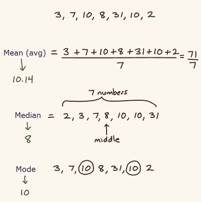
Measured by central tendency — a single value representing the center point, or central location, of the dataset. Mean, median, or mode.
Anything that is not shape, center, or spread: clusters, gaps, and outliers.
Symmetry, skewness, and peaks.
Also called dispersion. Measured by range, IQR, variance, or standard deviation.
Center and Spread
Descriptive Statistics
Center — Central Tendency
Central tendency is a single value that represents the center point of a dataset, sometimes called the central location. There are three ways to measure it.
The measure that separates the data into two halves, upper and lower. It is the middle value of the list once the list is arranged in order.
Applies to
Quantitative data only.
Behavior
Resistant — a single extreme value barely moves it.
The arithmetic average of a set of values.
Applies to
Quantitative data only.
Behavior
Non-resistant — every value pulls on it, so outliers drag it toward the tail.
The most frequently occurring value in a set of data.
Applies to
Both quantitative and qualitative data — the only measure of center that works on categorical data. It is rarely useful for describing a quantitative distribution.
Typo in the original. The bullet under Mean reads “Median applies only to Quantitative Data” — copied down from the entry above it. It should say Mean.
Center and Skew
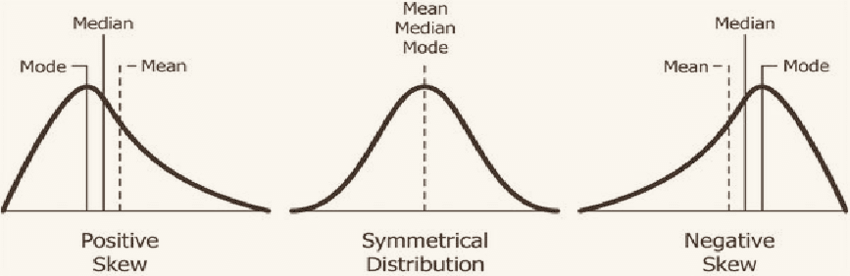
Positively skewed (right)
Negatively skewed (left)
Perfectly symmetric
The mean is always the one dragged furthest toward the tail, because it is the only measure that uses every value. That is the whole rule — find the tail, and the mean is nearest it.
Correction. The negative-skew line in the original reads “Mode ≤ Mean ≤ Modde.” Besides the repeated word, the order is wrong. Negative skew reverses the positive case exactly: Mean ≤ Median ≤ Mode.
Unusual Features
Distinct ways to describe a distribution that are not shape, center, or spread.
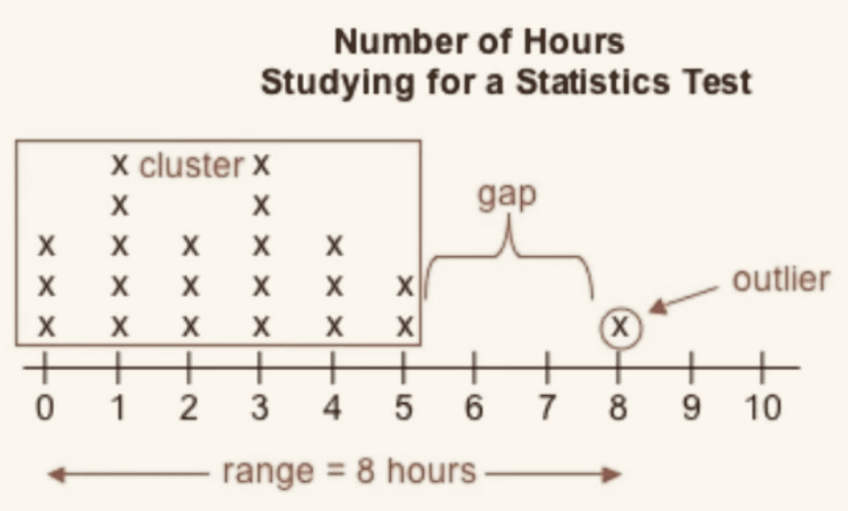
Natural subgroups into which the values fall. A cluster often means two different populations got mixed into one dataset.
Ranges where no values fall within a dataset.
Data values that differ considerably from the bulk of a dataset. An outlier is not automatically an error — it may be the most interesting point you have — but it must be identified and mentioned.
Finding Outliers
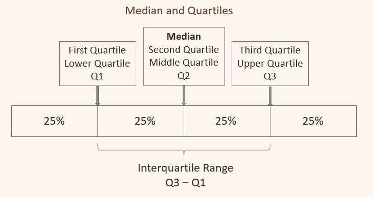
- Q1 — 25% of the data falls below this value
- Median (Q2) — 50% falls below
- Q3 — 75% falls below
The middle 50% of the data — the difference between the 75th and 25th percentiles.
High outlier
Multiply the IQR by 1.5, add it to Q3. Any value above that is a high outlier.
Low outlier
Multiply the IQR by 1.5, subtract it from Q1. Any value below that is a low outlier.
A second common rule flags anything more than two to three standard deviations from the mean. Use the IQR rule when the data is skewed, since it does not depend on the mean.
Shape
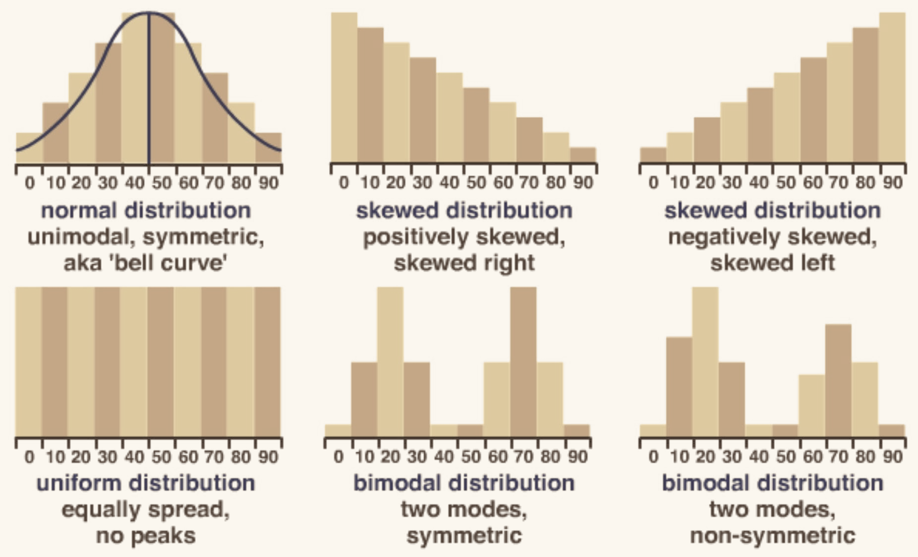
Symmetry
Two sides that are mirror images of each other.
Skewness
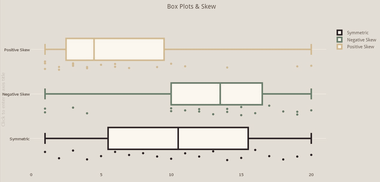
Noticeably more points on one side of the center than the other. The skew is named for the direction of the tail, not the bulk — a pile on the left with a long right tail is skewed right.
Peaks
Areas with higher data counts than the surrounding values. One peak is unimodal, two is bimodal.
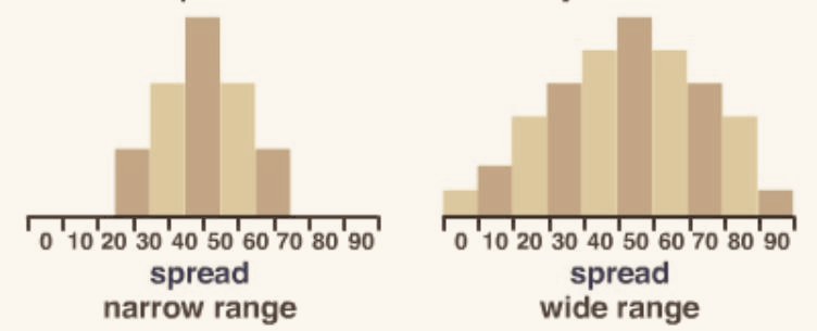
Spread
Spread, or dispersion, is the extent to which a distribution is stretched or squeezed. Which measure you use is tied to which measure of center you chose.
- If the data is skewed
- If there are outliers
- If the distribution is approximately or exactly normal
- If there are no outliers and it is bell shaped
The average of the squared differences between each value and the mean. Because the differences are squared, it is measured in squared units — different units from the data itself.
The square root of the variance. Measured in the same units as the mean, which is why it is the better of the two for describing a distribution.
Correction. Both formulas in the original are missing the exponent on the deviation — they read Σ(x − x̄) rather than Σ(x − x̄)2. Without the square the numerator always sums to exactly zero, since deviations above and below the mean cancel. Squaring is what makes the whole thing work.
The range is one value. Writing “the range is 50 to 100” is not a range — that is an interval. The range is 50.
Graphical Displays
Descriptive Statistics
Frequency Tables
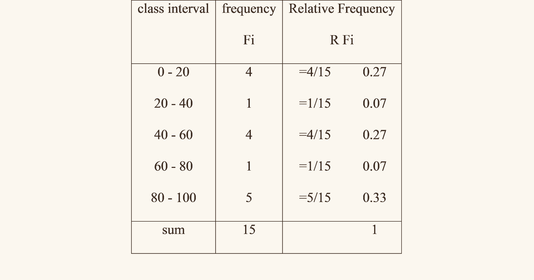
The number of members of a population or sample falling into a particular category — or, for quantitative data, into a particular class.
Frequencies expressed as proportions of the whole. They always add up to 1, and can be written as percentages instead, in which case they add to 100%.
The running sum of the frequencies — every observation at or below this class.
The running sum expressed as a proportion of the total. The final entry is always 1, or 100%.
Displaying Categorical Data
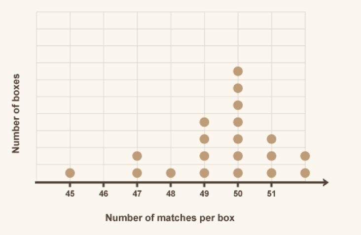
Graphing the data from a frequency table. These displays are for categorical data — knowing which one to reach for is half the question.
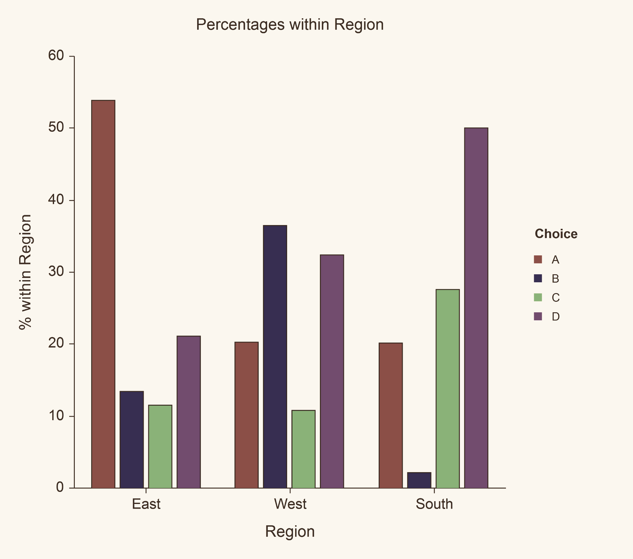
- Always include spaces between the bars
- Only for categorical data
- Most time efficient to read
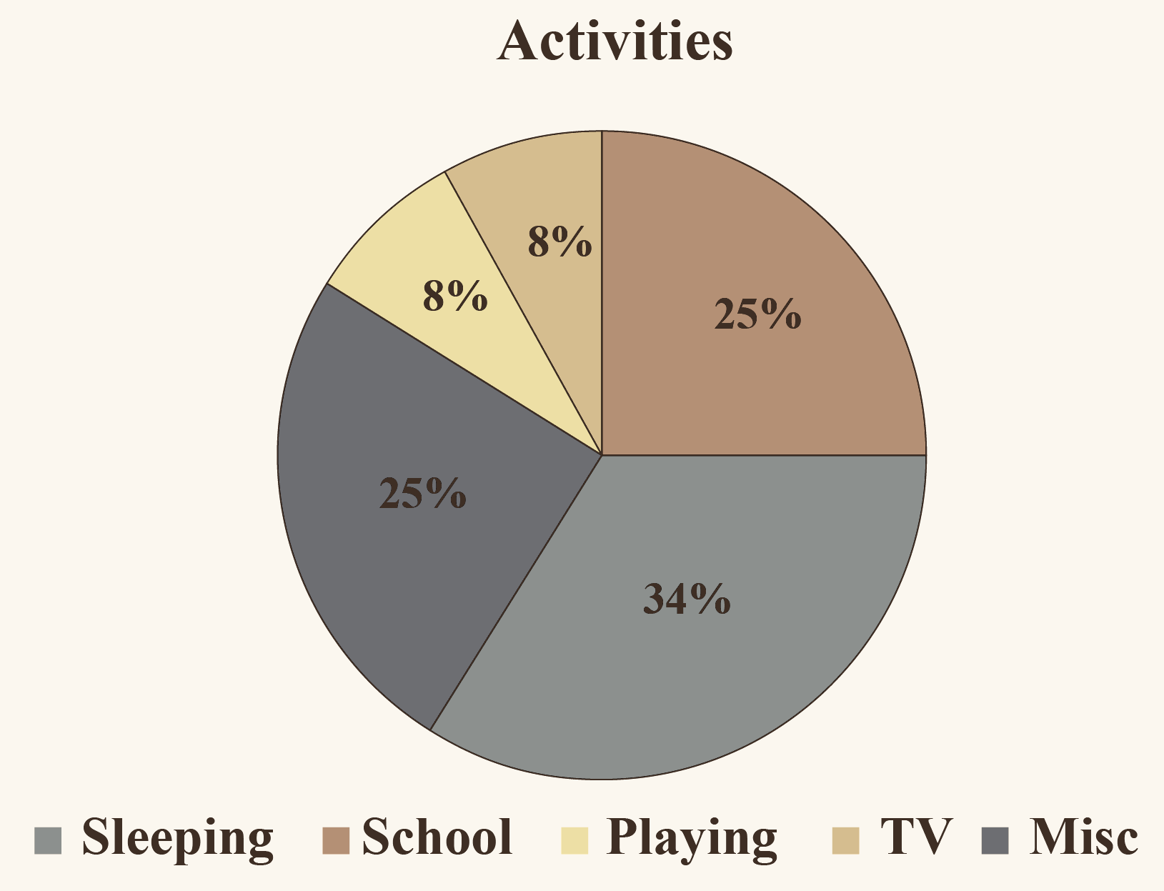
- Avoid if another option is available
- The slices must sum to 100%, or 1
- Humans compare angles poorly, which is why bar charts usually win
Displaying Numerical Data
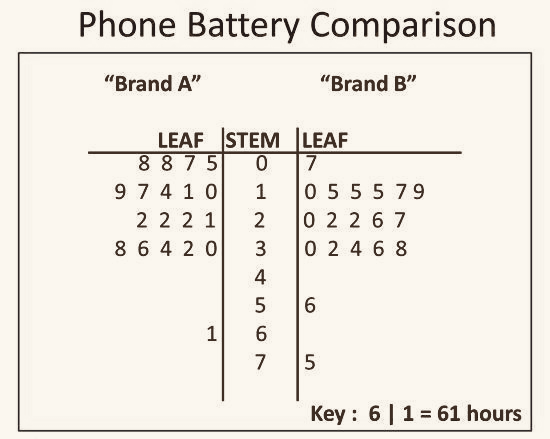
There is no mathematical rule for what counts as a stem and what counts as a leaf — the nature of the data decides. With two-digit scores you might take the first digit as the stem and the second as the leaf, so 42 becomes 4 | 2.
- Splitting stems is also called back-to-back
- Always include a key
- Keeps every original value visible, unlike a histogram
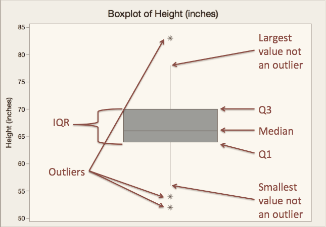
Used to display a dataset through its median statistics. To construct one, draw a box above a number line:
- Left edge of the box at Q1
- Right edge of the box at Q3
- A line through the box at the median
- Whiskers from the center of each edge out to the minimum and maximum
When asked to describe a boxplot or give a five number summary, state the minimum, Q1, median, Q3, and maximum — in context, with units — and name any outliers.
More on box plots
- Can be drawn vertically or horizontally
- Only one axis, and it must be labeled
- If there is an outlier, the whisker stops at the next largest value that is not an outlier
- There can be more than one outlier
- Useful for showing skew, and for comparing groups side by side
Histograms
Histogram: a diagram of rectangles whose area is proportional to the frequency of a variable, and whose width equals the class interval.
Histograms are measured in relative areas — frequency densities — not relative heights. This only matters when bins have different widths, but that is exactly when students get it wrong.
- Frequency tables can be displayed as histograms as long as the data is numerical, not categorical
- The biggest distinction from a bar chart is that histograms have no spaces between bars
Worth tightening. The original writes “Area = frequency of a variable ÷ class interval.” That quantity is the bar’s height — its frequency density. The bar’s area is the frequency itself, since height × width = (frequency ÷ width) × width.
- The width is also called bins, classes, or intervals
- Bins cover a range of the variable of interest
- The boundaries are the first and last values of each interval
- The midpoints are the middle values between the boundaries
- Bins in one histogram can be different lengths
The height measures the frequency of the bin — strictly, the frequency density when bin widths vary.
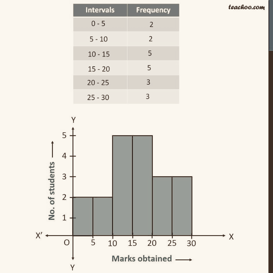
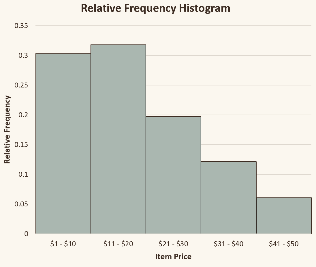
- Heights can be written as percents or decimals
- If percents, the heights must total 100%
- If decimals, the heights must total 1
- Converting a frequency histogram to a relative frequency histogram changes only the y-axis — the shape is identical
Cumulative Frequency Plots
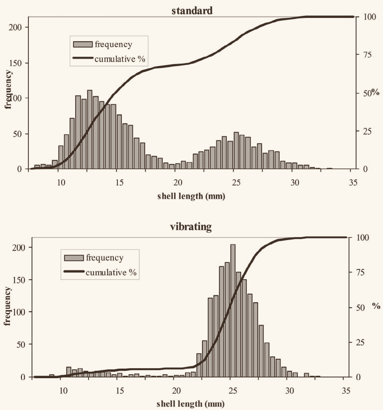
In a dataset, the cumulative frequency for a value x is the total number of scores less than or equal to x. A cumulative frequency plot draws those values graphically.
- Histograms are usually the data drawn for cumulative frequency plots
- Displays the number, percentage, or proportion of observations less than or equal to a particular value
- A relative cumulative frequency plot is one where the y-values total 1, or 100%
- The curve never decreases — a running total cannot go down
- Steepest where the data is densest; flat across a gap
Z-Scores and Position
Descriptive Statistics
Normalcy
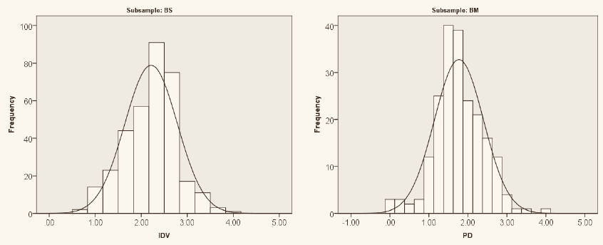
A distribution is considered approximately normal if it is:
- Symmetrical
- Unimodal
- Bell-shaped
Any roughly normal distribution can be standardized by converting its values into z-scores: subtract the mean from each value, then divide by the standard deviation.
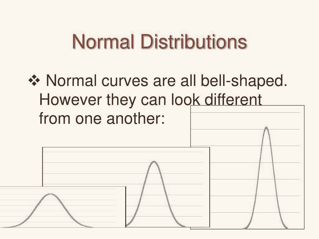
The bell curve, the Gaussian distribution, and the normal curve are all names for the same thing. The standard normal curve is the special case where the standard deviation is 1 and the mean is 0.
- It is a theoretical probability distribution — use parameter terms
- Like a histogram, the total area under the curve is always 1, or 100%
- Used to approximate the position of a value within the data
- The points of inflection — where the curve is steepest — sit exactly one standard deviation from the mean
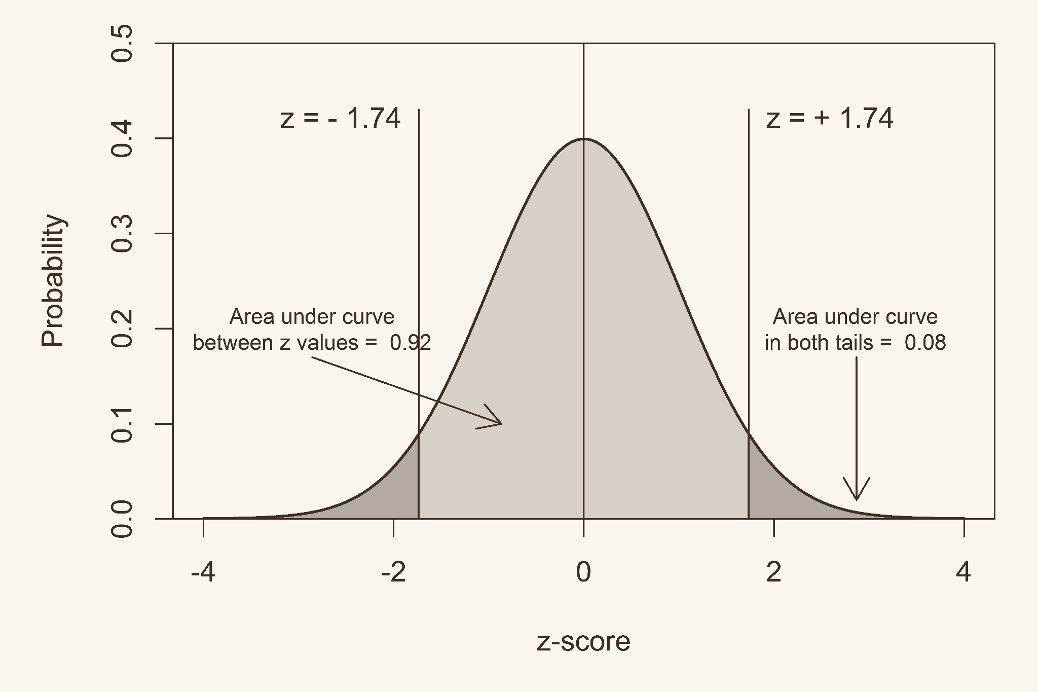
- ±1σ — about 68.3% of values fall within one standard deviation of the mean
- ±2σ — about 95.4% fall within two
- ±3σ — about 99.7% fall within three
Correction. The original ends with “the empirical rule only applies to standard normal distributions.” It applies to any approximately normal distribution, whatever its mean and standard deviation. That is the entire point of the rule — on a distribution with μ = 500 and σ = 100, roughly 68% of values still fall between 400 and 600. The standard normal is just the case where μ = 0 and σ = 1.
Z-Scores
A z-score describes the position of a raw score in terms of its distance from the mean, measured in standard deviation units.
Raw score
Data that has not been converted or altered in any way — the actual value of the unit of interest (x). The entire unaltered dataset is the raw data set.
- Positive if the value lies above the mean, negative if below
- A z-score of 0 is the mean
- In practice it rarely falls outside −3 to +3
- Only use z-scores if the conditions for normalcy are met
From z = (x − x̄) ÷ SD, the following must be true:
Correction. The third rearrangement in the original reads x̄ = (z)(SD) + x. Solving z = (x − x̄) ÷ SD for the mean gives x̄ = x − (z)(SD) — subtract, not add. Quick check with the first identity: if x = z·SD + x̄, then moving z·SD across gives x̄ = x − z·SD.
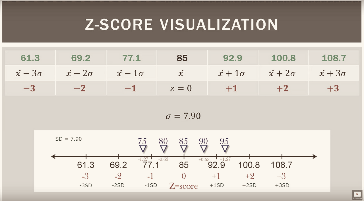
- Showing approximately how many standard deviations a raw score sits from the mean
- With a z-table or calculator, showing what percentile a raw score falls in — how much of the data lies above or below it
A z-score of 0 is the 50th percentile.
1. Simple ranking
Arrange the elements in order and note where a particular value falls. Needs the most additional information to be meaningful.
2. Percentile ranking
Indicates what percentage of all values fall at or below the value under consideration.
3. Z-score
States specifically how many standard deviations a value sits above or below the mean. The most precise of the three.
Z-Tables
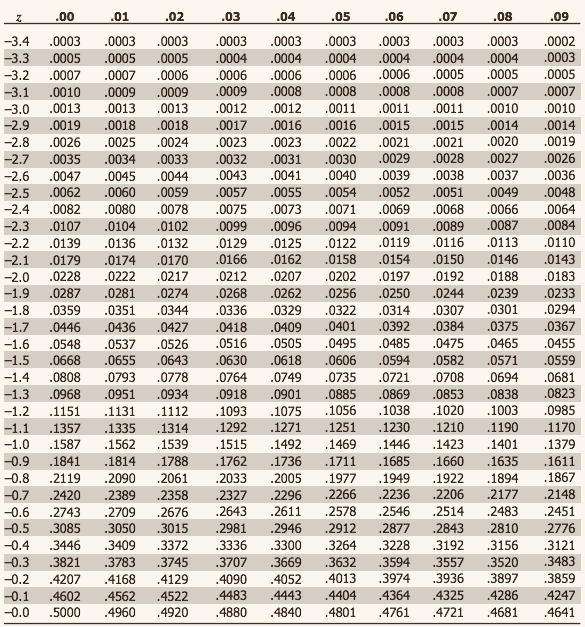
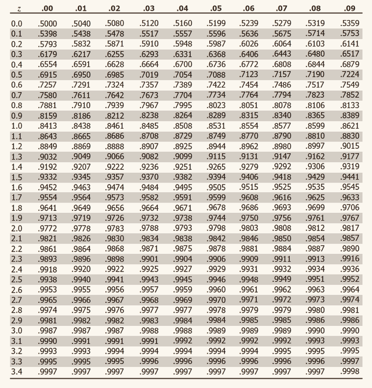
A z-table, also called the standard normal table, gives the area under the curve to the left of a z-score — which is the same as the percentile. That area is the probability that a z-value falls in that region, and the total area under the standard normal curve is 1.
- Row and column headers define the z-score — row to the tenths, column to the hundredths
- Table cells represent the area
- The table is split into two sections, negative and positive z-scores
- Negative z-scores are below the mean; positive are above
- No z-score above 3.49 or below −3.49
Find the area you want inside the body of the table, then read the z-score off the row and column headers. Convert back to a raw score with x = (z)(SD) + x̄.
Other uses (later units)
- Finding p-values
- Sampling distributions
- Finding probabilities across a range of z-scores
Probability
The mathematics behind inference
Foundations of Probability
Conditions
Variables
- —
- —
Conditions
Variables
- —
- —
Rules and Set Language
Probability
Language of sets
Union, intersection, complement.
Conditions
Variables
- —
- —
Conditions
Variables
- —
- —
Addition rules
General and special addition rules.
Conditions
Variables
- —
- —
Conditions
Variables
- —
- —
Conditional Probability
Probability
Conditional probability
Conditions
Variables
- —
- —
Conditions
Variables
- —
- —
Independence and Bayes
Conditions
Variables
- —
- —
Conditions
Variables
- —
- —
Combinatorics
Probability
Permutations and combinations
Conditions
Variables
- —
- —
Conditions
Variables
- —
- —
Fundamental counting principle
Conditions
Variables
- —
- —
Conditions
Variables
- —
- —
Discrete Random Variables
Distributions over countable outcomes
Expected Value and Variance
Conditions
Variables
- —
- —
Conditions
Variables
- —
- —
Binomial Distribution
Discrete Random Variables
When binomial applies
Fixed n, two outcomes, constant p, independent trials.
Conditions
Variables
- —
- —
Conditions
Variables
- —
- —
Mean and variance
Conditions
Variables
- —
- —
Conditions
Variables
- —
- —
Geometric and Poisson
Discrete Random Variables
Geometric distribution
Conditions
Variables
- —
- —
Conditions
Variables
- —
- —
Poisson distribution
Conditions
Variables
- —
- —
Conditions
Variables
- —
- —
Continuous Random Variables
Densities, areas, and the four key curves
Density and Area
Conditions
Variables
- —
- —
Conditions
Variables
- —
- —
Uniform and Exponential
Continuous Random Variables
Continuous uniform
Conditions
Variables
- —
- —
Conditions
Variables
- —
- —
Exponential distribution
Conditions
Variables
- —
- —
Conditions
Variables
- —
- —
(z) Standard Normal Distribution
Continuous Random Variables
The z-score
Conditions
Variables
- —
- —
Conditions
Variables
- —
- —
Finding areas and cutoffs
Conditions
Variables
- —
- —
Conditions
Variables
- —
- —
T-Distribution
Continuous Random Variables
Shape and degrees of freedom
Conditions
Variables
- —
- —
Conditions
Variables
- —
- —
When to use t instead of z
Conditions
Variables
- —
- —
Conditions
Variables
- —
- —
Chi-Squared Distribution
Continuous Random Variables
Shape and degrees of freedom
Conditions
Variables
- —
- —
Conditions
Variables
- —
- —
Where it appears
Conditions
Variables
- —
- —
Conditions
Variables
- —
- —
F-Distribution
Continuous Random Variables
Shape and two degrees of freedom
Conditions
Variables
- —
- —
Conditions
Variables
- —
- —
Where it appears
Comparing two variances, and every ANOVA F-test.
Conditions
Variables
- —
- —
Conditions
Variables
- —
- —
Sampling Distributions
How a statistic behaves across samples
The Bridge to Inference
This is the concept that makes every formula after it make sense. A sampling distribution is the distribution of a statistic across all possible samples — not the distribution of the data.
Conditions
Variables
- —
- —
Conditions
Variables
- —
- —
Central Limit Theorem
Sampling Distributions
The theorem
Conditions
Variables
- —
- —
Conditions
Variables
- —
- —
Why n ≥ 30
Conditions
Variables
- —
- —
Conditions
Variables
- —
- —
Distribution of the Sample Proportion
Sampling Distributions
Center and spread of p̂
Conditions
Variables
- —
- —
Conditions
Variables
- —
- —
Standard error of a proportion
Conditions
Variables
- —
- —
Conditions
Variables
- —
- —
Confidence Intervals
Estimating a population parameter
Confidence Intervals
point estimate ± margin of error
Purpose: to estimate a population parameter using a sample statistic.
The form depends on: whether the variable is quantitative or categorical, whether the population standard deviation is known, the sample size, and how many samples are involved.
One sample means
Confidence interval
(t-interval)
Conditions
- Random sample
- Normality, or n ≥ 30
- Population σ is unknown
Variables
- x̄ — sample mean (the point estimate)
- s — sample standard deviation
- n — sample size
- SE = s√n
- df = n − 1
- t* = invT(CL, df)
- ME = t* · SE
Formula
Confidence interval
(z-interval)
Conditions
- Random sample
- Normality, or n ≥ 30
- Population σ is known
Variables
- x̄ — sample mean (the point estimate)
- σ — population standard deviation
- n — sample size
- SE = σ√n
- z* = invNorm(CL, 0, 1)
- ME = z* · SE
Formula
Two sample means — independent
Confidence interval
(pooled t-interval)
Pooled standard deviation
Conditions
- Random samples
- Independent samples
- Normality, or n ≥ 30
- Equal variances: σ12 = σ22
Variables
- x̄1, x̄2 — the two sample means
- s1, s2 — the two sample standard deviations
- sp — pooled standard deviation
- df = n1 + n2 − 2
- t* = invT(CL, df)
Point estimate is the difference of the means.
Confidence interval
(Welch’s method)
Conditions
- Random samples
- Independent samples
- Normality, or n ≥ 30
- Unequal variances: σ12 ≠ σ22
Variables
- x̄1, x̄2 — the two sample means
- s1, s2 — the two sample standard deviations
- df — from the Welch–Satterthwaite formula; let the calculator compute it
- t* = invT(CL, df)
This is the default two-sample interval when you cannot justify equal variances.
Two sample means — dependent
Confidence interval
(paired t-interval)
Conditions
- Random sample of pairs
- Each pair is matched or repeated on the same subject
- The differences are approximately normal, or n ≥ 30
Variables
- d̄ — mean of the paired differences (the point estimate)
- sd — standard deviation of the differences
- n — number of pairs
- df = n − 1
- t* = invT(CL, df)
Compute each difference first, then treat the differences as a single sample.
Proportions
Confidence interval
Conditions
- Random sample
- Normality: np̂ ≥ 10 and n(1 − p̂) ≥ 10
Variables
- p̂ — sample proportion (the point estimate)
- n — sample size
- SE = √p̂(1−p̂)n
- z* = invNorm(CL, 0, 1)
- ME = z* · SE
Formula
Confidence interval
Conditions
- Random samples
- Independent samples
- Normality in both groups: np̂ ≥ 10 and n(1 − p̂) ≥ 10
Variables
- p̂1, p̂2 — the two sample proportions
- n1, n2 — the two sample sizes
- z* = invNorm(CL, 0, 1)
Do not pool the proportions here. Pooling belongs to the two proportion hypothesis test, not the interval.
Two corrections from the original sheet. The proportion intervals were written with σ∕√n, which is the formula for a mean. A proportion has no separate σ — its standard error is built from p̂ itself, as shown above. The two proportion interval was also missing its z* multiplier.
One-Sample Proportion Methods
Confidence Intervals
Wald (textbook)
The method most intro texts present. Under-covers when p̂ is near 0 or 1.
Conditions
Variables
- —
- —
Conditions
Variables
- —
- —
Wilson (score)
Generally the best default.
Conditions
Variables
- —
- —
Conditions
Variables
- —
- —
Agresti–Coull (plus-four)
Add two successes and two failures, then run Wald.
Conditions
Variables
- —
- —
Conditions
Variables
- —
- —
Clopper–Pearson (exact)
Guaranteed coverage, but conservative — intervals run wide.
Conditions
Variables
- —
- —
Conditions
Variables
- —
- —
Determining Sample Size
Confidence Intervals
Sample size for a mean
Conditions
Variables
- —
- —
Conditions
Variables
- —
- —
Sample size for a proportion
Conditions
Variables
- —
- —
Conditions
Variables
- —
- —
Hypothesis Testing
Tests, errors, and decision rules
Hypothesis Testing — Fundamentals
Null hypothesis (H0)
A claim of no effect or status quo. Always stated with equality: μ = μ0 or p = p0.
Alternative (Ha)
A claim of a difference, an effect, or a directional change.
Two-tailed
“Is there evidence the average salary differs from $60,000?”
Right-tailed
“Is the new drug more effective than the standard?”
Left-tailed
“Did the training reduce average completion time?”
Test statistic
It counts how many standard errors the sample result sits from the null value.
Standard error
The standard deviation of the sampling distribution.
P-value
The probability of observing a result at least as extreme as the sample result, assuming H0 is true. It is not the probability that H0 is true.
Significance level (α)
The threshold set before the test. Common values are 0.10, 0.05, and 0.01.
If p ≤ α
Reject H0. There is sufficient statistical evidence to reject the null hypothesis in favor of the alternative.
If p > α
Fail to reject H0. There is not enough statistical evidence to reject the null hypothesis.
Wording
Never say you “accept” the null or that you “proved” anything. Failing to reject means the evidence was insufficient, not that H0 is true.
Type I error (α)
Rejecting H0 when it is actually true. A false alarm — concluding an effect exists when it does not. Its probability is exactly α.
Type II error (β)
Failing to reject H0 when it is actually false. A missed detection — a real effect goes unnoticed.
Power
The probability of correctly detecting a real effect. Power rises with larger n, larger effect size, and larger α.
Choosing Pooled-t or Welch
Before running a two-sample t-test you have to decide whether the two population variances can be treated as equal. That decision is itself a hypothesis test, and its outcome only tells you which t-test to run next.
Hypotheses
Degrees of freedom
df1 = n1 − 1 (numerator), df2 = n2 − 1 (denominator). Put the larger variance on top.
The counterintuitive part
Rejecting the null here means the variances are unequal. So rejection sends you to Welch, and failing to reject sends you to pooled-t.
Pooled standard deviation
Both samples contribute to one shared estimate of spread, weighted by their degrees of freedom.
Unpooled standard error
Each sample keeps its own variance. Degrees of freedom come from the Welch–Satterthwaite approximation.
Correction from the original sheet. The original used a chi-square test to compare the two variances. Chi-square tests a single variance against a fixed value; comparing two variances is an F-test, since the ratio of two sample variances follows an F-distribution. The chi-square test for one variance still appears below under Chi-Squared Tests.
Tests for Means
Hypothesis Testing
Hypothesis Tests — Means
Conditions
- Random sample
- Normality, or n ≥ 30
- σ unknown
Variables
- μ0 — the value claimed by H0
- s — sample standard deviation
- df = n − 1
Calculator: T-Test.
Conditions
- Random sample
- Normality, or n ≥ 30
- σ known
Variables
- μ0 — the value claimed by H0
- σ — population standard deviation
Calculator: Z-Test.
Conditions
- Random, independent samples
- Normality, or n ≥ 30
- Equal variances
Degrees of freedom
Calculator: 2-SampTTest with Pooled: Yes.
Conditions
- Random, independent samples
- Normality, or n ≥ 30
- Unequal variances
Degrees of freedom
Welch–Satterthwaite approximation. Let the calculator handle it.
Calculator: 2-SampTTest with Pooled: No.
Conditions
- Random sample of matched pairs
- The differences are approximately normal, or n ≥ 30
Variables
- d̄ — mean of the paired differences
- μd — hypothesized mean difference, usually 0
- sd — standard deviation of the differences
- n — number of pairs
- df = n − 1
Calculator: build a list of differences, then run T-Test on that list.
Tests for Proportions
Hypothesis Testing
Hypothesis Tests — Proportions
Conditions
- Random sample
- np0 ≥ 10 and n(1 − p0) ≥ 10
Variables
- p̂ — sample proportion
- p0 — the value claimed by H0
The standard error uses p0, not p̂ — the test assumes H0 is true. This is the one place the test and the interval differ.
Pooled proportion
Conditions
- Random, independent samples
- At least 10 successes and 10 failures in each group
Under H0 the two proportions are equal, so the successes are combined into one pooled estimate.
Chi-Squared Tests
Hypothesis Testing
Chi-Squared Tests
Conditions
- Random sample
- All expected counts ≥ 5
- Categories are mutually exclusive
- Observations are independent
Expected frequency
Degrees of freedom
Independence tests one sample on two variables. Homogeneity tests several samples on one variable. The arithmetic is identical; only the wording of the conclusion changes.
Conditions
- Random sample
- All expected counts ≥ 5
- Categories are mutually exclusive
- Observations are independent
Expected frequency
Degrees of freedom
Variables
- O — observed frequency
- E — expected frequency
- pi — expected theoretical proportion
- k — number of categories
Conditions
- Paired, matched, or repeated samples
- The response has two outcomes
- At least 10 discordant pairs: b + c ≥ 10
Variables
- b — subjects who changed No → Yes
- c — subjects who changed Yes → No
Degrees of freedom
Only the discordant pairs carry information. Subjects who did not change are ignored.
Hypotheses
Ha is >, <, or ≠ depending on the tail.
Conditions
- Random sample
- The population is normal — this test is very sensitive to that
Degrees of freedom
This compares one variance to a fixed value. To compare two variances, use the F-test.
ANOVA
Hypothesis Testing
ANOVA
ANOVA compares three or more group means at once by asking whether the variation between groups is large relative to the variation within groups.
Hypotheses
Ha: at least one mean differs. Not “all means differ.”
Conditions
- Random sample from each group
- Independent samples, not paired
- Normally distributed populations
- Equal population variances (homogeneity of variance)
Sums of squares
- SSA — between groups: Σ ni(x̄i − x̄grand)2
- SSE — within groups: Σ (ni − 1)si2
- SST = SSA + SSE
Degrees of freedom
- Between = k − 1
- Within = N − k
- Total = N − 1
Mean squares
- MST = SSAk − 1
- MSE = SSEN − k
k is the number of groups, N is the total number of observations across all groups.
What it tests
Three F-tests at once: a main effect for factor A, a main effect for factor B, and an interaction between them.
Sums of squares
Interaction
A significant interaction means the effect of one factor depends on the level of the other. Interpret it before the main effects.
When to use
A significant ANOVA says at least one mean differs, but not which. A post-hoc test finds the specific pairs while controlling the family-wise error rate.
Common tests
- Tukey HSD — all pairwise comparisons
- Bonferroni — divides α by the number of comparisons
- Scheffé — most conservative, handles complex contrasts
Running many individual t-tests instead inflates the Type I error rate.
When to use
When a known nuisance variable adds variation you want removed. Subjects are grouped into blocks that are similar on that variable, and every treatment appears once in every block.
Sums of squares
Degrees of freedom
Treatments: k − 1. Blocks: b − 1. Error: (k − 1)(b − 1).
Blocking pulls variation out of SSE, which shrinks MSE and raises the power of the test.
Nonparametric Tests
Hypothesis Testing
Nonparametric Tests
These tests drop the normality assumption. They work on ranks or signs instead of raw values, so they handle skewed data and outliers, and they test medians rather than means.
When to use
To check whether a two-outcome sequence is random — plus and minus signs, male and female, defective and good.
Variables
- R — observed number of runs
- μR — expected runs under randomness
A run is an unbroken streak of the same outcome. Too few runs suggests clustering; too many suggests alternation.
When to use
To test whether a population median equals a hypothesized value, with no assumption of normality.
Variables
- x — number of values above the hypothesized median
- p = q = 0.5 under H0
Use the exact binomial for small n; the normal approximation for large n.
When to use
To compare two related or paired samples for a difference in medians. The nonparametric counterpart to the paired t-test.
Rank the absolute differences, reattach the signs, then sum the positive ranks. It uses the size of the differences, not just their direction, which makes it more powerful than the sign test.
When to use
To compare two independent samples for a difference in medians. The nonparametric counterpart to the two-sample t-test.
Variables
- R1 — sum of ranks in sample 1
- n1, n2 — the two sample sizes
Rank all observations together, ignoring which group they came from.
When to use
To measure monotonic association between two variables when the relationship is not linear or the data are ordinal.
Variables
- di — difference between the two ranks for observation i
- n — number of paired observations
Ranges from −1 to 1, read the same way as Pearson’s r.
When to use
To compare medians across three or more independent groups. The nonparametric counterpart to one-way ANOVA.
Variables
- Ri — sum of ranks in group i
- ni — size of group i
- N — total observations
- df = k − 1
H follows a chi-square distribution when each group has at least five observations.
Regression
Modeling a relationship
Regression
Hypotheses
Conditions
- Linearity
- Independent observations
- Constant variance of residuals
- Normally distributed residuals
Degrees of freedom
Hypotheses
Degrees of freedom
Usually less interesting than the slope. The intercept is only meaningful when x = 0 falls inside the observed range of the data.
Hypotheses
Ha: at least one slope is nonzero.
Variables
- SSR — regression sum of squares, explained variation
- SSE — error sum of squares, unexplained variation
- k — number of predictors
- r2 = SSRSST — proportion of variation explained
In simple linear regression this F-test and the slope t-test give identical p-values, because F = t2.
Simple Linear Regression
Regression
The least-squares line
Conditions
Variables
- —
- —
Conditions
Variables
- —
- —
Residuals and r²
Conditions
Variables
- —
- —
Conditions
Variables
- —
- —
Multiple Regression and OLS
Regression
Multiple regression
Predicts one dependent variable using several independent variables.
Conditions
Variables
- —
- —
Conditions
Variables
- —
- —
OLS rules
Conditions
Variables
- —
- —
Conditions
Variables
- —
- —
Model diagnostics
Conditions
Variables
- —
- —
Conditions
Variables
- —
- —
Choosing the Right Test
A decision guide for picking the right procedure
The Flowchart
Work top to bottom, one question at a time. The highlighted box is the gatekeeper of the two-sample branch: before choosing between pooled-t and Welch, you test the sample variances. Rejecting that test means the variances are unequal — which sends you to Welch.
Start Here
Most students can run a t-test. The hard part is knowing that it is a t-test. Work down these four questions in order and the test picks itself.
Quantitative
Numbers you can average — height, salary, test score. You are working with means. Go to question 2.
Categorical
Group labels — yes/no, brand, party. You are working with proportions or counts. Two categories with a yes/no split points to a proportion test. Three or more categories, or a two-way table, points to chi-squared.
One
One-sample t-test, or z-test if σ is known. Go to question 3.
Two
Two-sample test. Go to question 4 to decide which one.
Three or more
ANOVA. Follow a significant result with a post-hoc test to find which pairs differ.
Yes — σ is given
Use z. In practice this almost never happens outside a textbook.
No — you only have s
Use t. This is the realistic case and the default.
Paired
Same subjects measured twice, or matched pairs. Compute the differences and run a paired t-test on that single list.
Independent, equal variances
Pooled t-test. Justify equal variances with an F-test first.
Independent, unequal variances
Welch. This is the safer default when you are unsure.
Common Mix-Ups
Ask whether each value in group one has a natural partner in group two. Before-and-after on the same person is paired. Two separate classrooms are independent. Equal sample sizes do not make data paired.
For proportions, a confidence interval uses p̂ in the standard error, while a hypothesis test uses p0, because the test assumes the null is true. Using the wrong one is a quiet error that still produces a plausible number.
Bivariate Data
Two variables at once
Two Variable Data Analysis
Univariate analysis describes one variable at a time. Bivariate analysis asks whether two variables move together — and the tools you use depend entirely on whether those variables are categorical or quantitative.
Displayed in contingency tables, segmented bar charts, and mosaic plots. Summarized with joint, marginal, and conditional frequencies.
Go to
- Contingency Tables
- Relative Frequency Tables
- Conditional Distributions
Displayed in scatterplots. Summarized with the correlation coefficient r and modeled with the least squares regression line.
Go to
- Scatterplots
- Correlation Coefficient
- Least Squares Regression
- Residuals and Sums of Squares
Associated vs Correlated
These are not synonyms, and using the wrong one on a free response question costs points.
Describes a linear relationship, and only between two quantitative variables. It is measured by r.
Describes any relationship, linear or not. This is the word to use for categorical variables, because there is no line to fit — categories have no numeric order to be linear about.
Contingency Tables
Bivariate Data
Contingency Tables
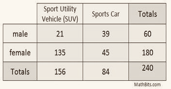
Qualitative data often involves two categorical variables that may or may not have a dependent relationship. These are displayed in a two-way table, also called a contingency table.
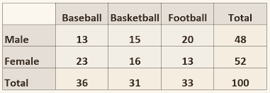
- Columns — vertical set of data (Baseball)
- Rows — horizontal set of data (Male)
- Cells — a single box where a row and column intersect
A cell representing the sum of a row or a column. The grand total is always the bottom right cell.
Joint Frequencies
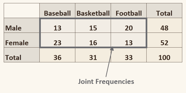
Think of prisoners who are in the “joint” — the answer is always inside the table, never on the edge.
- A joint frequency is just one cell
- A joint relative frequency is an inner cell divided by the grand total
It answers “how many are both A and B” — both conditions at once.
Marginal Frequencies
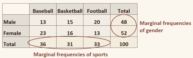
Think of the margins of a page — the margins are on the outside.
- Marginal frequencies are the subtotals, not the grand total
- A marginal relative frequency is a subtotal divided by the grand total
It answers “how many are A” while ignoring the other variable entirely.
Conditional Frequencies
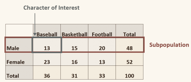
Think of the everyday meaning of condition — a limit. You limit yourself to one row or one column, and that becomes your whole world.
- The row or column you restrict to is the subpopulation
- The variable you then read across is the character of interest
It answers “given that someone is A, how many are B” — which is exactly conditional probability, arriving early.
Relative Frequency Tables
Bivariate Data
Relative Frequency Contingency Tables
Just like a contingency table, except every cell is divided by the grand total. The new values can be written as a percent or a decimal.
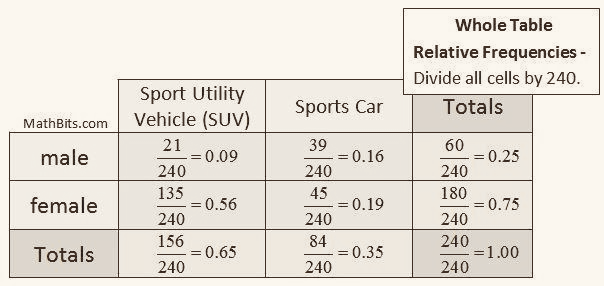
Conditional Relative Frequencies
Conditional relative frequencies divide by the row or column total instead of the grand total. That is the entire difference.
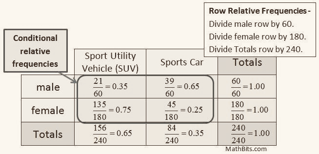
Answers “of the males, what fraction chose each vehicle.”
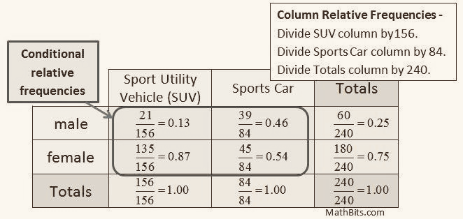
Answers “of the SUV owners, what fraction were male.”
- No value can be above 1, or 100%
- The total of whichever direction you divided by is always 1, or 100%
- Determining a marginal distribution is just finding the marginal relative frequency of each categorical variable
If your row percentages do not sum to 100%, you divided by the wrong total. That is the fastest error check in this unit.
Conditional Distributions
Bivariate Data
Displaying Conditional Distributions
Each subpopulation gets its own cluster of bars. Easiest for comparing a single category across groups.
Like a pie chart, except the data set is represented by a rectangular bar rather than a circle. Each bar totals 100%, so you are comparing shares rather than counts.
Mosaic Plots
A special type of stacked bar chart. For two variables, the width of each column is proportional to the number of observations at that level of the horizontal variable, while the height within the column shows the conditional distribution.
- Similar to a segmented bar graph, except area carries meaning as well as height
- Spaces must be added between the rectangles
The payoff over a segmented bar chart: you can see group size and group composition in one picture. A wide narrow-striped column is a big group with a lopsided split.
Independence and Simpson’s Paradox
Perfect independence is when all the conditional frequency distributions are identical — that is, no association.
Even if two variables are completely independent, it is very rare that a resulting two-way table will show perfect independence. Sampling variation alone guarantees some wobble. That gap between “independent in the population” and “identical in the table” is exactly what the chi-squared test later measures.
An association that holds within every subgroup can reverse direction when the subgroups are combined into one table. Nothing is miscalculated — both results are arithmetically correct.
Why it happens
A lurking variable is distributed unevenly across the groups. When you pool, that imbalance dominates the comparison.
Classic example
A hospital with worse overall survival rates than another may have better rates for both mild and severe cases — because it treats far more severe cases. Pooling hides the case mix.
What it means practically
Always ask what was aggregated away before trusting a two-way table. This is the strongest argument in the whole unit for looking at conditional distributions rather than totals.
Scatterplots
Bivariate Data
Explanatory and Response Variables

The expected cause — it explains the result. Its value does not depend on the other variable.
The result — it is what is being explained. Its value depends on changes in the explanatory variable.
Which explains which
The (Ex)planatory variable (ex)plains the response variable.
Which axis
E-(x)-planatory = x-axis. The response goes on the y-axis.
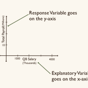
Worth softening. The original defines the independent variable as “the cause.” That holds in a controlled experiment, where the researcher assigns the treatment. In an observational study — which is most data students meet — the explanatory variable is only the suspected cause, and a lurking variable may be doing the real work. Since correlation-versus-causation is the most heavily tested idea in this unit, it is safer to say the explanatory variable is the one you use to predict, not the one that causes.
Describing a Scatterplot
Direction
Positive or negative. Larger values of one variable associated with larger values of the other means positively associated.
Unusual features
Outliers, clusters, gaps — and points with high influence on the line.
Form
Linear or nonlinear. Curved, exponential, or something else.
Strength
How tightly the points cling to the pattern — strong, moderate, or weak.
All four in context, naming the variables and their units. The same discipline as C.U.S.S. in Unit 1.
Correlation Coefficient (r)
Bivariate Data
The Correlation Coefficient (r)
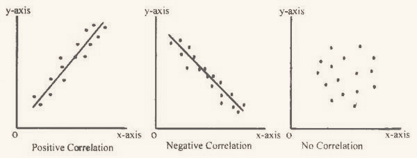
What scatterplots are used for is determining correlation. The symbol is r, the correlation coefficient.
Each bracket is a z-score, so this is the same as r = 1n−1 Σ (zx)(zy). Changing units does not change r, because z-scores have no units.
Correction. The original writes this denominator as (n∕1) in one place — “r = (1/(n/1)) sum of (Zx)(Zy).” It is n − 1, matching the sample standard deviation. Dividing by n∕1 = n would inflate every r.
Six Properties of r
- r is negative or positive, and exactly zero when there is no linear correlation
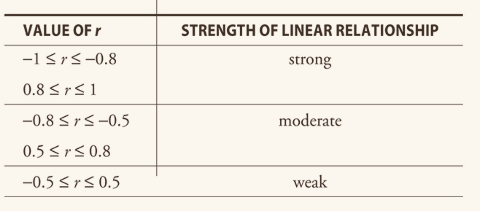
- All r values fall in −1 ≤ r ≤ 1
3. Order does not matter
It does not matter which variable is x and which is y. r depends on the paired points, not on which is treated as the ordered pair’s first entry. Swapping the axes leaves r unchanged — but it does not leave the regression line unchanged.
4. r is unitless
Not dependent on units. Convert a graph from hours to minutes and r stays identical, because it is built from z-scores.
5. r is not resistant
It is based on the mean, so extreme values pull it. This is exactly why you look at the scatterplot and not just the number.
6. Positive association
Larger values of one variable associated with larger values of the second means the variables are positively associated.
Correction. The original states the range as −1 ≤ r ≥ 1. The second symbol points the wrong way — as written it says r is both at least −1 and at least 1, which would force r = 1 every time. It should read −1 ≤ r ≤ 1.
Context Beats the Number
A correlation of 0.9 might not be good enough in a cancer study, where a treatment decision rides on it. A correlation of 0.1 might be grounds for a major financial change, if the position is large enough that a slight edge compounds.
The bands are a convention for describing a scatterplot, not a standard for deciding whether a relationship matters. What counts as strong depends on the stakes and on what else is known.
Least Squares Regression
Bivariate Data
The Least Squares Regression Line
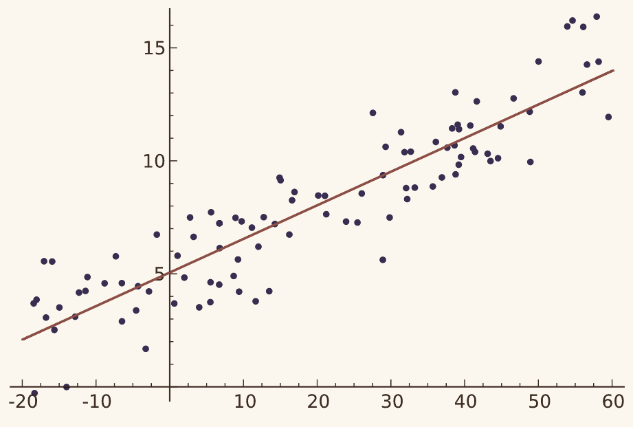
Of all possible lines, the LSRL is the one with the smallest sum of the squared residuals — the lowest possible SSE. There are various lines of best fit; this is the one this course uses.
Why the residuals are squared
Squaring stops positive and negative residuals from cancelling, and gives more weight to large misses, so the line is penalized harder for being badly wrong about one point than slightly wrong about several.
Finding it
In practice a calculator or program computes it. By hand you need r, both means, and both standard deviations.
Slope
Variables
- r — correlation coefficient
- sx — standard deviation of x
- sy — standard deviation of y
Read it as a weighted ratio of spread in y to spread in x, with r acting as a correction factor for how much of that spread is actually shared.
Template for interpretation
“There is a predicted increase / decrease of ______ (slope, in units of y) for every 1 (unit of x).”
The big three
- Context
- Correct definition
- The word predicted
Correction. The slope formula appears twice in the original with the fraction inverted the second time — once as r(sy∕sx) and once as r(sx∕sy). Only the first is right. Sanity check: slope carries units of y per unit of x, so sy must be on top.
Y-Intercept
It is reasonable, intuitive, and correct that the best-fitting line always passes through the point (x̄, ȳ).
Template for interpretation
“The predicted value of (y in context) is ______ when (x in context) is 0 (units in context).”
A caution
The y-intercept is not always meaningful in context. If x = 0 lies outside the observed data, reporting it is extrapolation.
Solving for ŷ:
The expression in parentheses is the y-intercept, a. To find any predicted value, plug the x of interest into this equation.
Correction. The original labels the point-slope variables as “y1 = not predicted variable” and “x1 = predicted variable,” which has it backwards — ŷ is the predicted value, and (x1, y1) is the known point the line passes through, namely (x̄, ȳ).
Equations Worth Memorizing
Converted to z-scores, the regression line has slope r and passes through the origin. This is why r is called the correlation coefficient — in standardized units it literally is the slope.
It also shows regression toward the mean: since |r| ≤ 1, a point one SD above average in x is predicted less than one SD above average in y.
Use LinReg option 8 rather than option 2. The AP exam writes the model as y = a + bx, and option 8 matches that ordering, so you do not have to rearrange your output.
Residuals
Bivariate Data
Residuals
The difference between the observed and predicted value is the residual. Remember the order with actual minus predicted — like AP courses, the order matters.
- yi — actual value
- ŷi — predicted value
- ε — the Greek letter epsilon, used for the error
The term y0 − ŷ0 = ε0 is called the error or residual. It is not an error in the sense of a mistake.
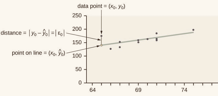
A data point above the line gives a positive residual — the model underestimated the actual value.
A data point below the line gives a negative residual — the model overestimated it.
- The sum of the residuals is always zero
- The absolute value of a residual measures the vertical distance between the actual data point and the predicted point on the line
Residual vs Variance
The difference between what a model predicted and the true value from the data. Measured vertically, against the line.
The variability of the data around its own mean. Measured against a horizontal line, not a fitted one.
Correction. The original lists the “variance formula” as xi − x̄. That is a single deviation, not a variance. Variance squares those deviations, sums them, and divides by n − 1 — the same formula from Unit 1.
Residual Plots
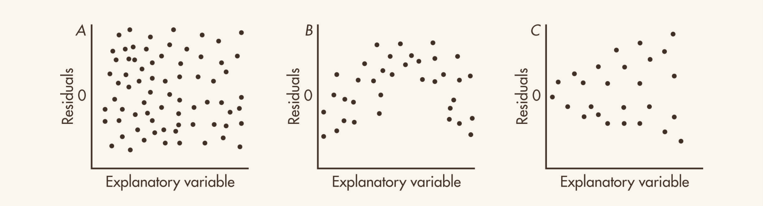
No pattern
Random scatter around zero. A linear model is appropriate.
Curvature
A visible arc means the relationship is not linear. Consider a transformation.
Fanning
Spread that widens or narrows across the plot means non-constant variance. The line may be fine but its predictions are less reliable at one end.
Residuals can be plotted against either the x-values or the ŷ values. Because ŷ is a linear transformation of x, the two plots are identical except for scale and a possible left-right reversal.
Sums of Squares
Bivariate Data
The Three Sums of Squares
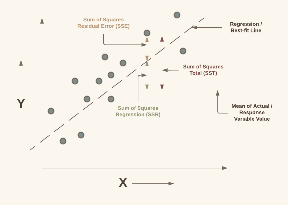
Every bit of variation in y is either accounted for by the model or left over. That is the whole idea, and it is what makes r² interpretable as a percentage.
Total variation in y, measured from the mean of y. How wrong you would be using ȳ alone as your prediction.
Variation the model explains — how far the line moves away from the flat mean line. Also written ESS, explained sum of squares.
A measure of how far a set of data points is from the fitted regression line, found by summing the squared differences between observed and predicted values. A smaller SSE indicates a better fit — and minimizing it is precisely what defines the least squares line.
If SSR equals SST, the model captures all observed variability and SSE is zero — a perfect fit.
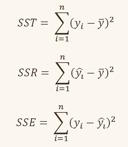
Labels swapped in the original. On the sums page the headings SSR and SST sit next to each other’s formulas. Match them by what is inside the parentheses: (yi − ȳ) is SST, (ŷi − ȳ) is SSR, and (yi − ŷi) is SSE. Actual minus mean, predicted minus mean, actual minus predicted.
Coefficient of Determination
Bivariate Data
Coefficient of Determination (r²)
Equivalently, since SST = SSR + SSE:
And it really is r squared:
Important correction. The original writes r² = SSE∕SST. It is SSR∕SST. Notably the expanded fraction written underneath it — Σ(ŷi−ȳ)² over Σ(yi−ȳ)² — is SSR∕SST, so the math was right and only the label was wrong. But a student who trusts the label will compute the fraction of variation the model fails to explain and report it as success. Sanity check: a perfect fit has SSE = 0, and r² must be 1, not 0.
Interpreting r²
r² gives the percentage of variation in the response variable that is explained by the linear relationship with the explanatory variable. It is one minus the unexplained proportion.
Usually reported as a percentage. An r² of 100% is a perfect fit, with all variation in y explained by variation in x.
Rough expectations
Controlled experiments often aim for r² above 90%. In observational studies, 10% to 20% can still be genuinely informative.
r = 0.6 is double the correlation of r = 0.3. But squared, 0.36 versus 0.09 — 36% is four times 9%.
Doubling r quadruples the variation explained. This is why a correlation that sounds moderate can explain surprisingly little, and why r and r² should never be described in the same words.
Transforming Data
Bivariate Data
When a Line Does Not Fit
Sometimes a linear model is a poor fit and a nonlinear model is better. The two this course covers are exponential and power models. Polynomial regression exists but requires linear algebra and is beyond this course.
A high r² does not mean a line is appropriate. Curvature in the residual plot does mean it is not. Always look at the residual plot before trusting a linear model.
In this course, the only relationship of concern is the linear one — everything else is handled by transforming the data until it becomes linear.
Linearizing by Transformation
What to transform
Take the natural log of the response column only.
Plotting ln(y) against x gives a straight line. Growth by a constant factor per step.
What to transform
Take the natural log of both columns.
Plotting ln(y) against ln(x) gives a straight line.
A linearized model is what you have once you have logged the data. Fit the LSRL to the transformed values, then undo the log to state the model in the original units.
The standard format for an exponential equation is y = a · bx, so a and b are what you are solving for.
The check
The transformation worked if the residual plot of the transformed data shows no pattern. That, not r², is the test.